Branding for MiCalisthenics
Democratizing sports for everyone
MADE ©BYFUGU
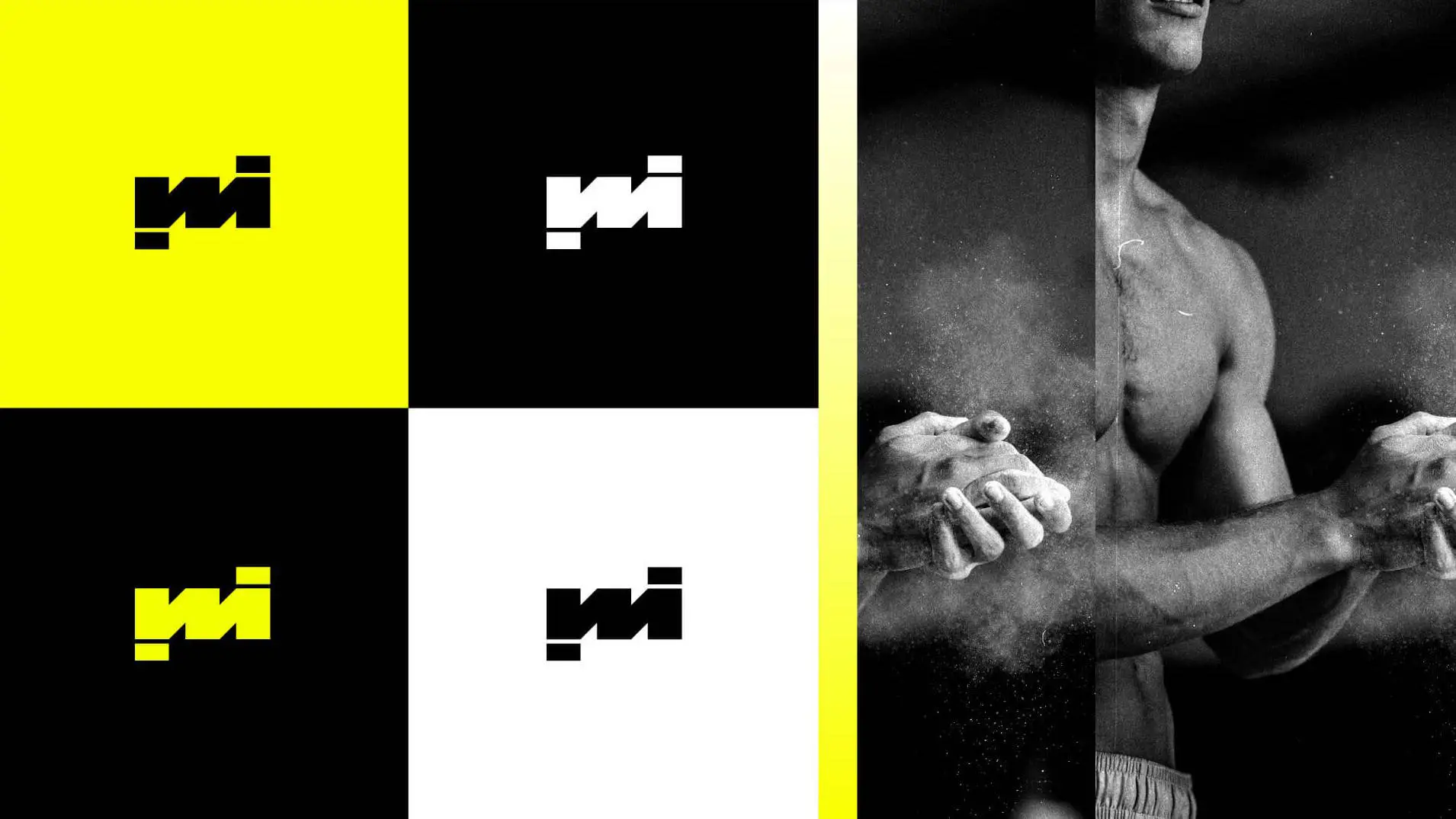
Our goal was to create a flexible and powerful visual system, adaptable for a wide and complex target audience. We designed a recognizable symbol based on the synthesis of the bodies of two athletes, making it resemble the brand's initials.
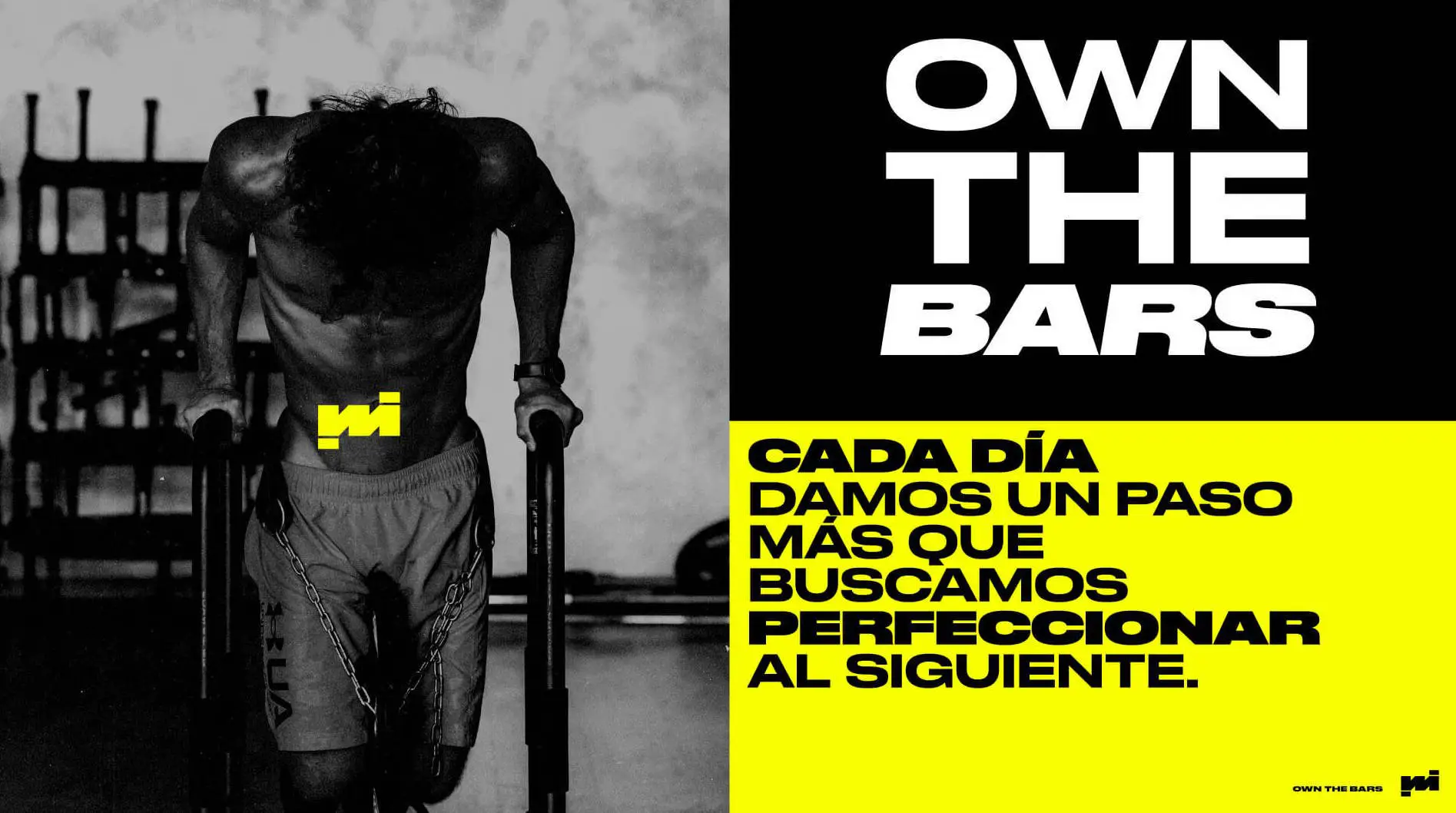
We wanted to give MiCalisthenics an active character, so we created dynamic pieces to reflect constant movement, mixing typographic compositions with real athletes' footage.


